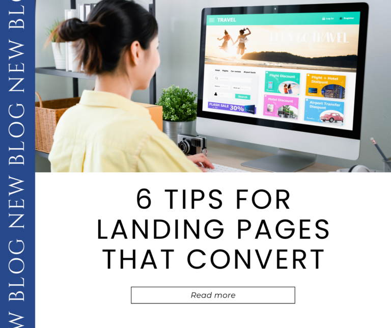
Are your landing pages doing their job? Wait—before you answer that, let’s back up for a minute.
As you probably know, a landing page is a single webpage created for a specific campaign. A visitor “lands” there after clicking a link on an ad, social media post, or email campaign.
The job of a landing page is to provide tailored content that will move viewers along in their customer journey. An ad gets the viewer to the landing page, and then the landing page brings the viewer closer to a sale! Oftentimes, it’s at this stage that a potential customer gives their information and becomes an official lead.

So, are your landing pages working as they should? If you’re looking to increase conversions, check out these six tips for great landing pages.
Tip 1: Get Clear on the Purpose.
What exactly is this landing page for? Do you want to track the efficacy of a certain campaign? Are you doing A/B testing on two different versions of an ad? When you’re clear on the landing page’s purpose, you’re able to build a better page. This also guides how you’ll use the data from your analytics tool.
Tip 2: Tailor Content to Your Audience.
Each landing page should be tailored to the exact audience that’ll be coming from the ad, social media post, or email that you’re sending out. Have a clear and appealing headline that conveys the content or offer and how it benefits that audience. Write your content with that audience’s specifics in mind. And make sure to put these 7 psychology principles to use!
Tip 3: Make it Match.
When someone clicks on a link, they already have an idea in their head about what they’ll see. When they click on an ad about a sale on winter coats, they expect to see the sale coats on the landing page, not full-priced coats or other clothing. When your landing page doesn’t match expectations, you’ll likely get a high bounce rate, which is the percentage of people who leave a page without taking any actions. Make sure your landing page reflects the exact offer of your ad or email, using similar keywords.
Tip 4: Include Carefully-Selected Images.
Images can help draw people’s interest, and they actually help people remember content better! Choose images that relate to your products or your current offer, but don’t use too many or it can distract from your content. Make sure your images align with your brand style guide. A video can work well here, too.
Tip 5: Have a Clear CTA.
Each landing page should have a clear goal for the visitor. That might be signing up for a free offer, making a purchase, or connecting with your sales team. You might add a bold, noticeable button with your CTA on it, like “Get my free ebook” or “Start my free trial,” so that people know exactly where to click and exactly what to expect.
Tip 6: Make Sure Your Form is Simple.
Request only the information you truly need at this stage, like name and email. If you request too much information, people may leave the page. You can always gather more information when they become a customer. Double- and triple-check the form to make sure people won’t have any issues submitting it. You can also give people the option to make an account by connecting to their Google or social media account.
Get Started Today:
Once you have your landing pages set up according to these tips, you can track your metrics through an analytics tool and use that data to perfect your process. As you improve your landing pages, you can expect to see an increase in the conversion rates! As you introduce new campaigns, continue to monitor and tweak your new landing pages according to the data.
If you need help with any part of this process, 2XM is here. Contact us for a FREE 60 minute consultation today.
